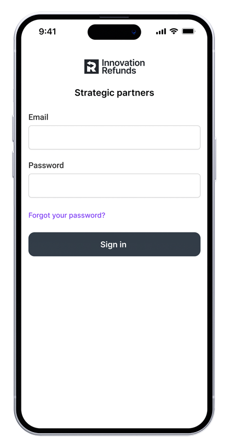
Affiliate customer portal
Created custom-built affiliate marketing portal to drive leads for small business tax credit program.

Problem
The marketing team initially launched a portal on HubSpot to engage existing customers and drive new business for our tax credit program. Unfortunately, the initial launch faced challenges, including low user activity and limited success with affiliate campaigns.
Solution
Our goal was to create a custom-built solution that would provide a seamless user experience for affiliate partners. This solution would empower them to efficiently launch and track affiliate marketing campaigns promoting various credits and incentives to small business owners. The primary focus was on simplifying the overall experience.
Challenges
The product and engineering teams were given a runway of 4 weeks to launch a new MVP, which ultimately left less than 2 weeks for design. This tight deadline required product, design, and engineering to be closely aligned on which features were critical for MVP.
Role
I was the lead designer responsible for end-to-end design and execution.
Deliverables
Customer feedback
User persona
UI/UX audit
Desktop designs
Mobile designs
User flows
Light/dark mode
Engineering hand-off
Design process
In order to set forth a phased approach for delivery to stakeholders, I developed a high-level outline of the design team's process methodology. This allowed the greater product team to level-set expectations for delivery of required design artifacts.
01. Discover
Gather user feedback, define user personas, and perform UX audit of current platform.
02. Plan
Establish specific and measurable objectives and plan project scope.
03. Design
Develop user flows and high-fidelity designs for desktop and mobile expereinces.
04. Hand off
Coordinate with engineering teams and prepare dev-ready Figma files.
Discovery
In order to understand the challenges, I led the product team in conducting user interviews with the initial pool of affiliate customers to get insights into customer pain points when using the existing affiliates portal. After analyzing the user feedback, I identified the following pain points:


John
Business owner
Age
Industry
Location
35
Construction
Virginia
User persona
"I'm a business owner on the go and I do most of my online business on my phone. The current experience requires me to be at my desk so I don't use it."
"It was difficult for me to find the button to create a new campaign. After searching around, I eventually found it buried on the homepage. It would be great for this action to be more accessible as it's a crucial part of the site."
"Once I create a campaign, I lose any insights into how it's performing. I need ta place where I can see all of my campaigns so I can track the number of users who have interacted with them."
Problem
The Hubspot experience does not satisfy John's needs as an affiliate customer. The current site is not moble-frinedly and does not allow him to view and manage his campaigns.
Strategy
We will focus on a mobile-first experience to align with John's on-the-go lifestyle. We will also prioritize a focus on creating and managing campaigns for him to track the effectiveness of his campaign efforts.
Planning our objectives
To set forth a tactical project plan, we created user stories that translated customer feedback into actionable objectives. These stories focused on specific tasks and goals, providing a clear framework for the design process and ensuring our solutions addressed real user needs.
As a product designer, I want to assess the current affiliate portal so that I can better unerstand customer pain points.
Use customer feedback to assess current platform
Understand current platform capabilites and limitations
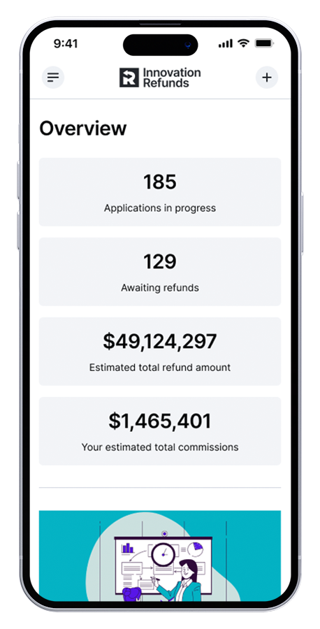
As an affiliate customer, I want to see a high level view of key performance metrics so that I can quickly monitor overall success.
Clear view of key performance indicators
Quick links to access customer resources
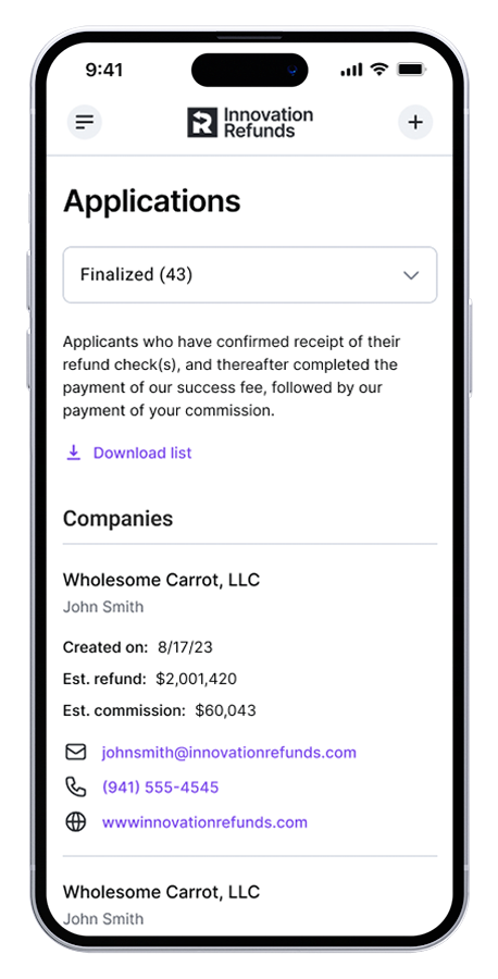
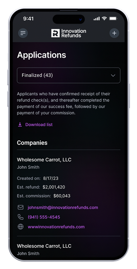
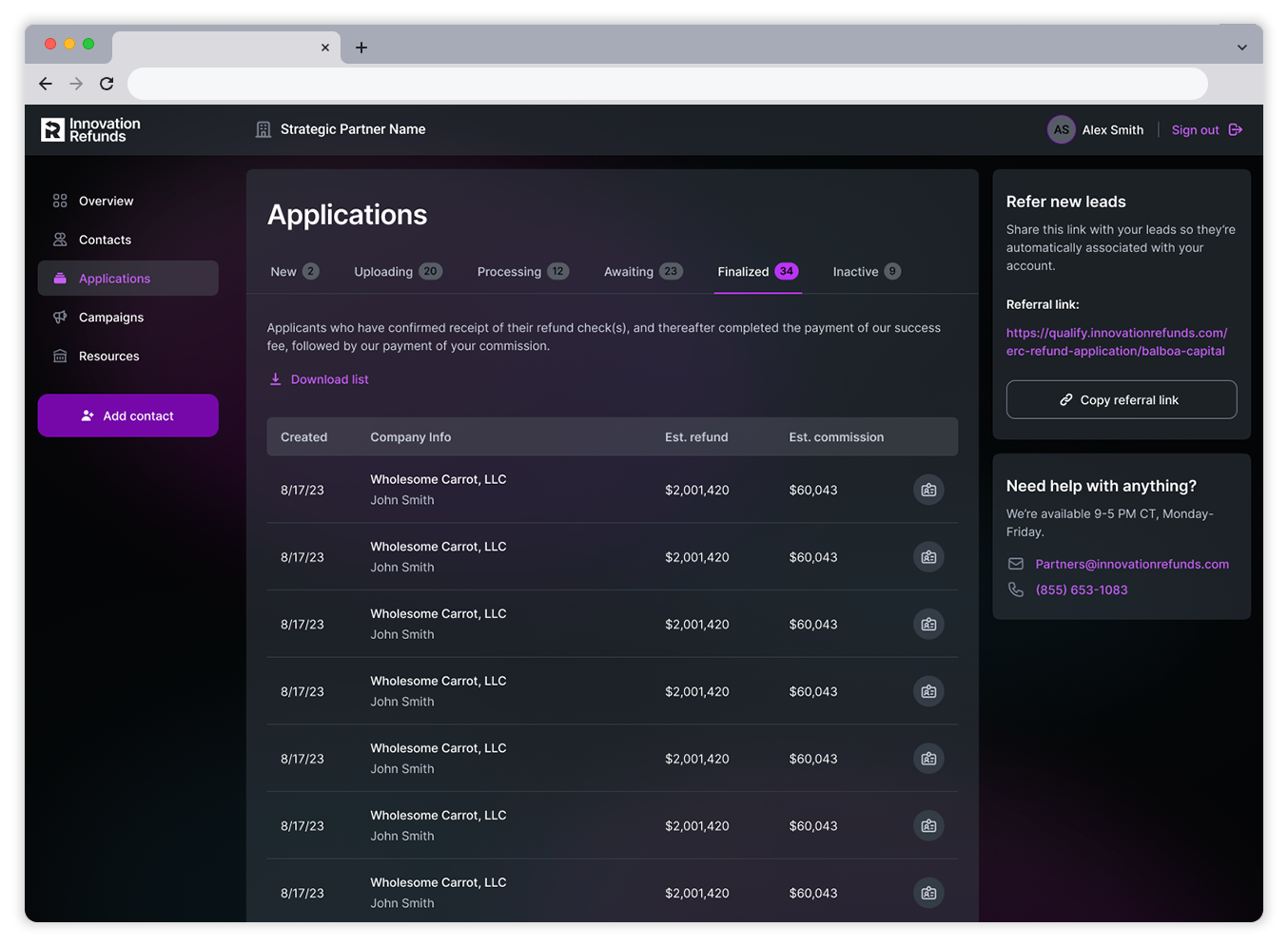
As an affiliate customer, I want to see a full list of all applications so that I can track where each application is in the process.
Include subnavigation to filter view based on the various stpes in the process
Include company name along with estimated refund and commission
Include download option of entire application list
As an affiliate customer, I want the ability to easily create marketing campaigns to promote Innovation Refunds services for providing tax credits so that I can drive customer adoption.
User can select various campaign types based on campaign goals
User can customize campaign message and
InUser can choose among various pre-created promotional banners
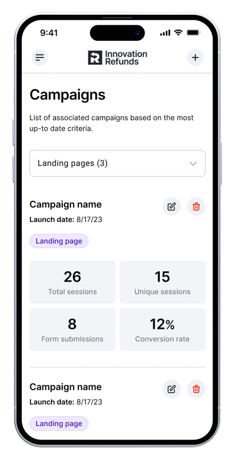
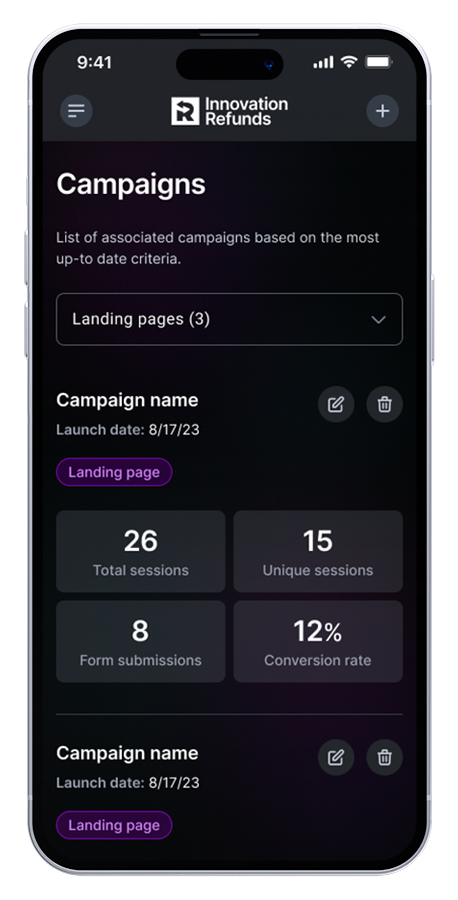
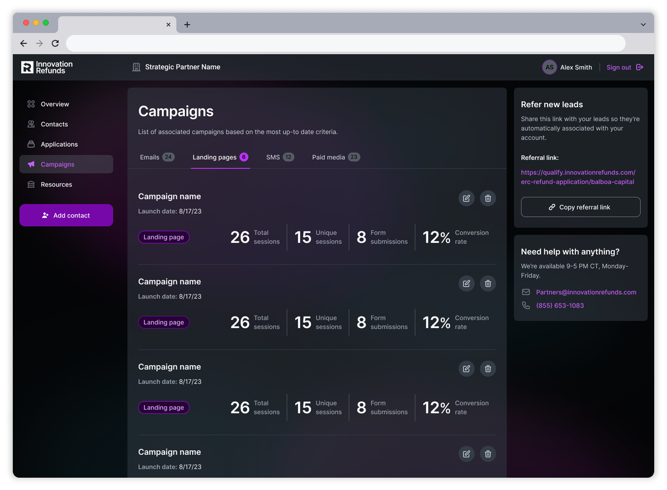
As an affiliate customer, I want to see a list of marketing campaigns I've initiated so that I can monitor success.
Real-time view of total sessions, form submissions and conversion rate
Include ability to edit and delete campaigns
Include subnavigation for all campaign types
As an affiliate customer, I want the ability to access my account on both desktop and mobile so that I can have flexibility in how I engage with the platform.
Frictionless and seamless expereince between mobile and desktop
Responsive design to allow for graceful degredation
Intuitive rearrangement of content based on device size
Out with the old
In order to address customer feedback concerning the the overall experience, I performed a UX audit of the Hubspot build to pinpoint user challenges. I noticed inconsistencies between various data views as well as data that missing alltogether, such as campaign insights. I also noticed primary calls to action were buried within a single page and not accessible throughout the rest of the site. After attempting to correct these issues within Hubspot, I determined we needed a custom-built solution to begin course-correcting our affiliates program.


Setting expectations
Kickoff
Before I could begin, I met with stakeholders to present my findings and understand objectives and timelines for the project. During our discussion, I discovered the product team only had 4 weeks to design and develop a custom-built solution. After getting buy-in to begin work, I then set out to identify and prioritize the critical goals for MVP to ensure a timely and successful launch.
Objectives
To ensure a successful and timely launch, I aligned the business on the following priorities:
Mobile-friendly user experience
Drive conversion through affiliate marketing campaigns
Allow affiliate customers to monitor campaign insights
In with the new
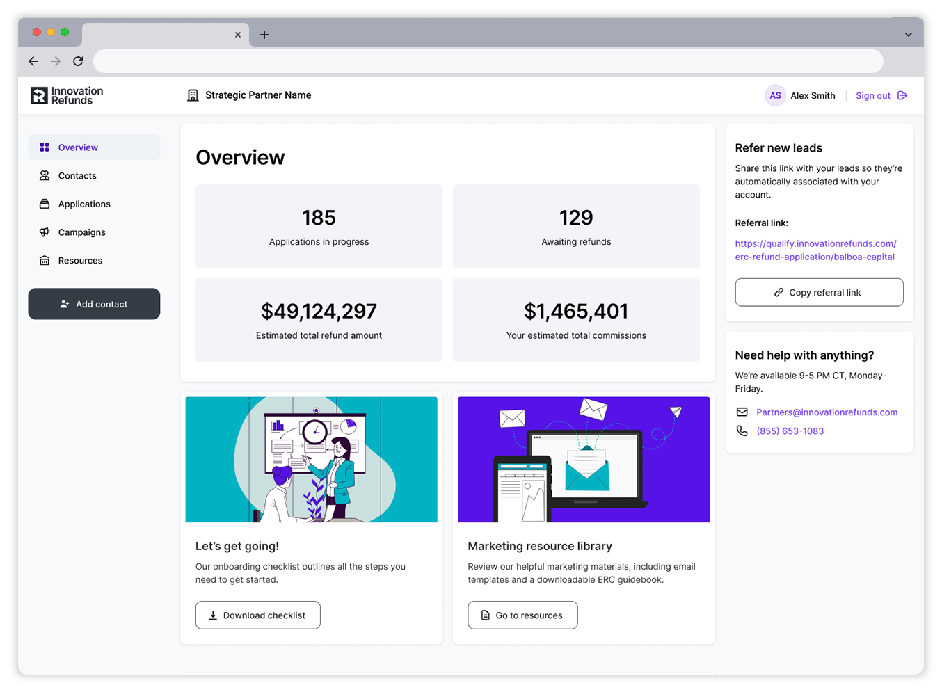
After the discovery phase, I began to redesign our desktop experience. I leveraged our internal design system and brand guidelines to establish the overall look and feel, applying our colors, font families, and layout. My approach was to create a clean and intuitive interface, removing as much clutter as possible, allowing for a more frictionless experience within the mobile view..
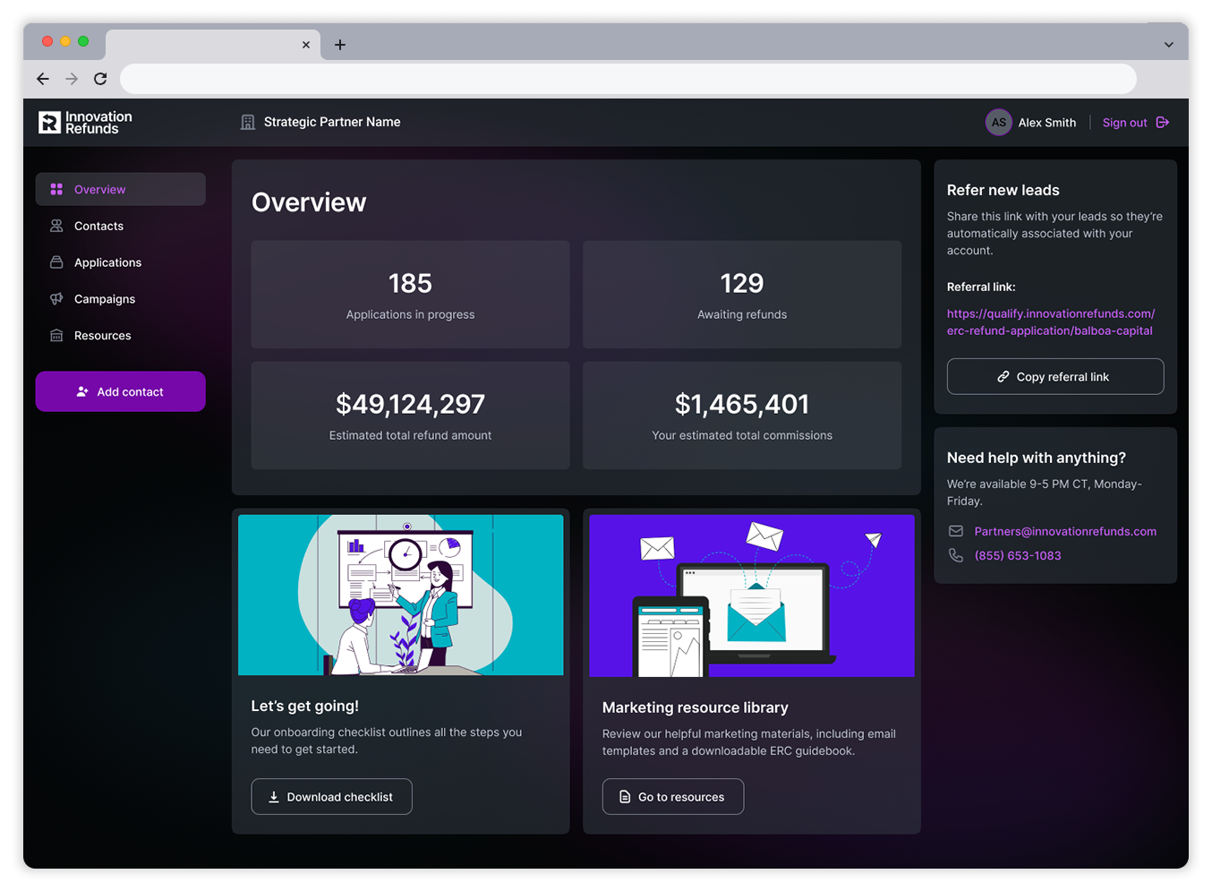
Navigate main site pages and create new marketing campaigns.
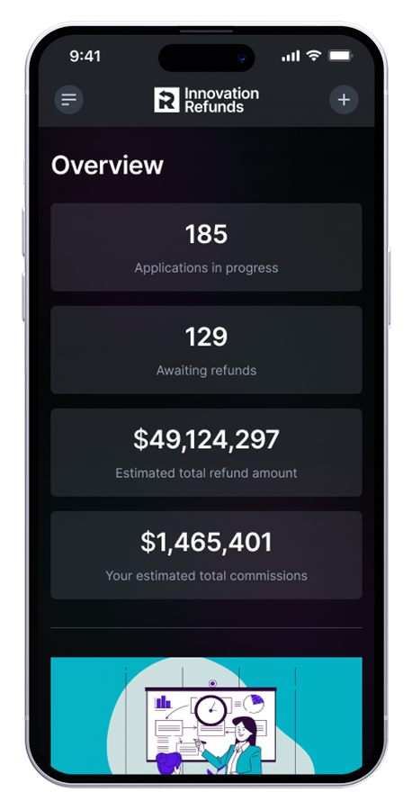
Track key performance indicators.
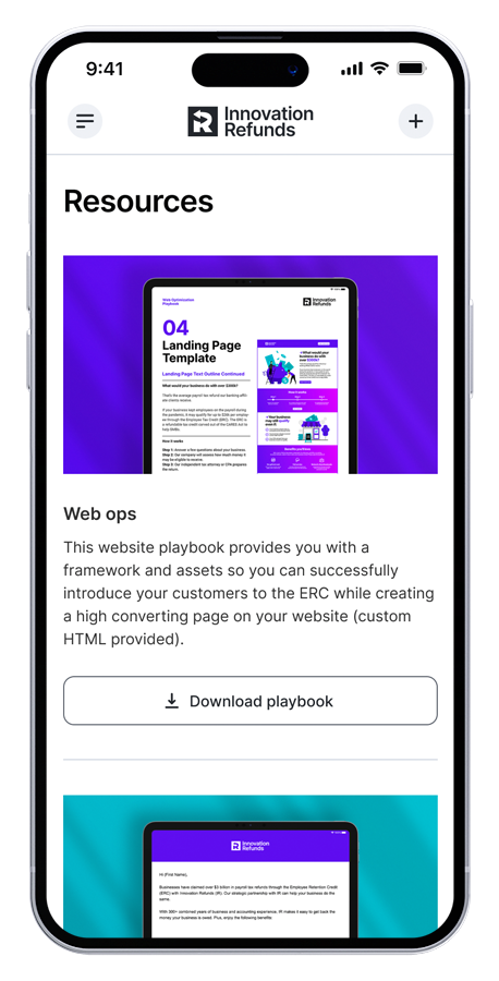
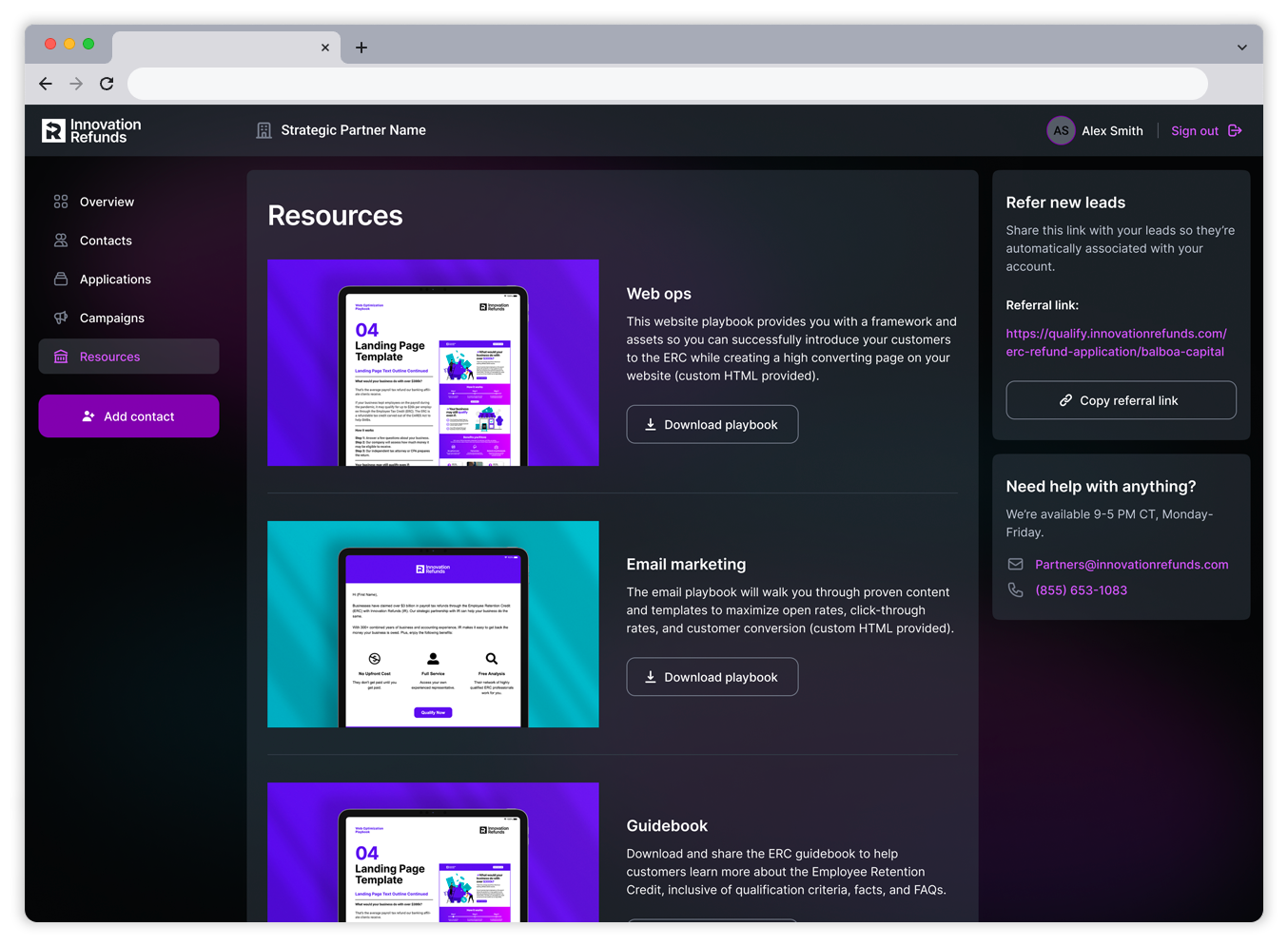
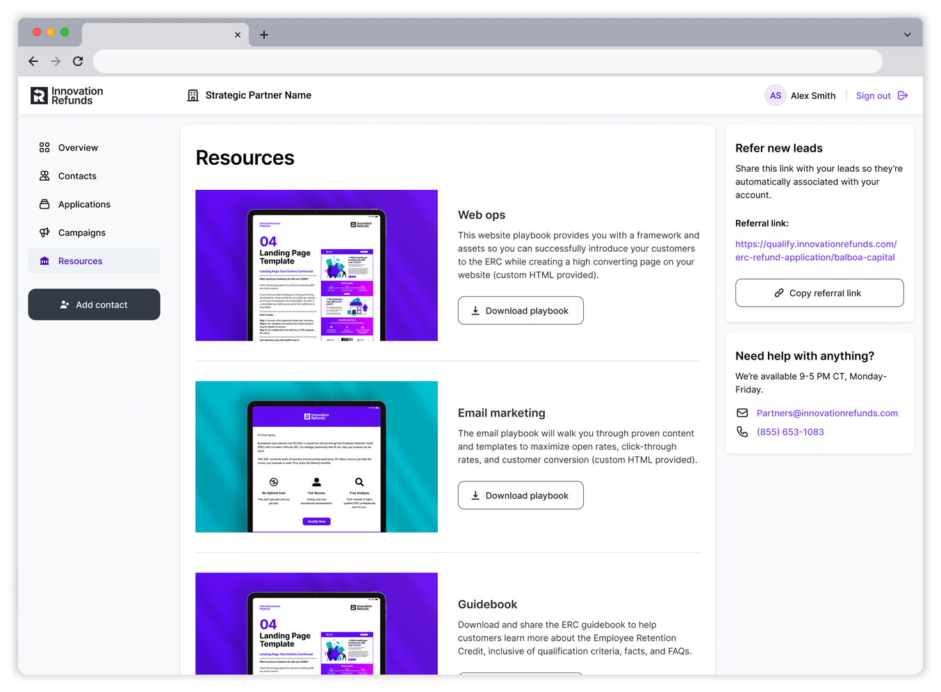
Access marketing resources and onboarding support.
Generate referral links and access help.

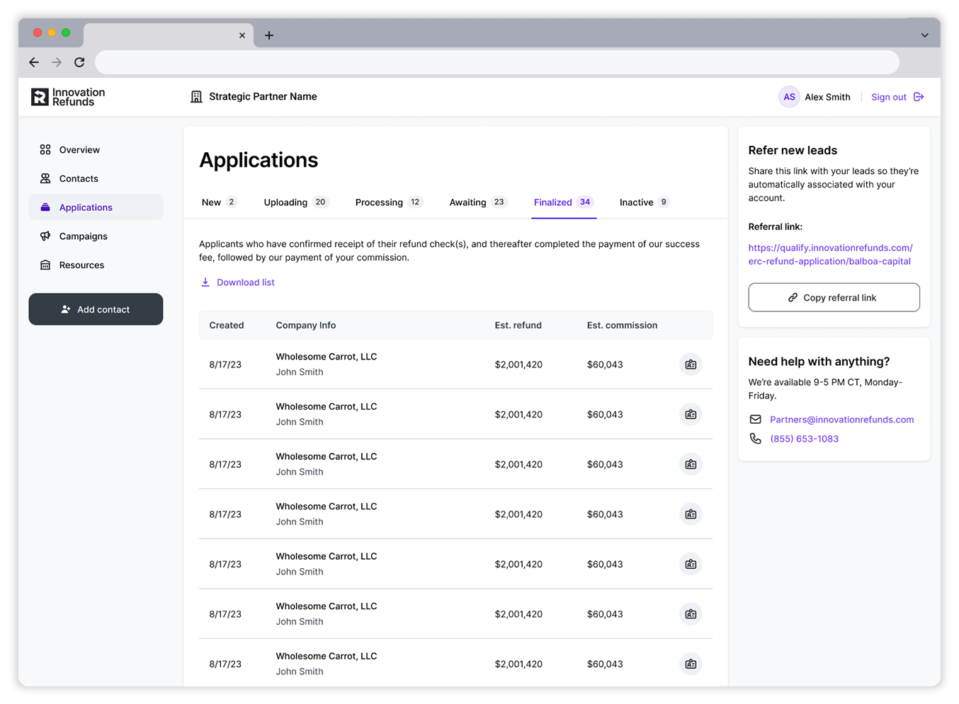
Navigate main site pages and create new marketing campaigns.
Filter list based on application statuses.
Organized list view displaying key information for each application.
Generate referral links and access help.

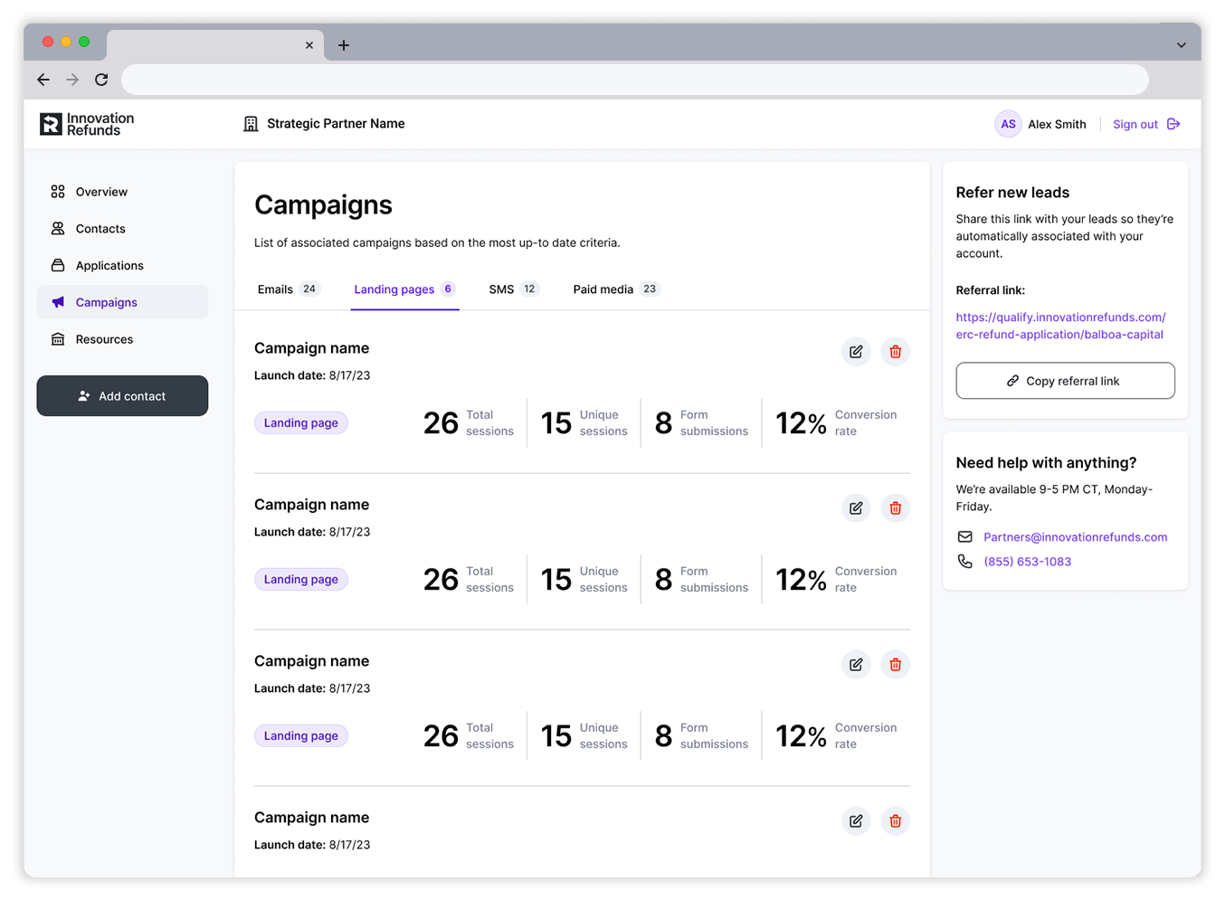
Navigate main site pages and create new marketing campaigns.
Access marketing resources and onboarding support.
Generate referral links and access help.

Making it responsive
Once the desktop experience was established, I then got to work on the mobile experience. To maintain a seamless responsive experience, I leveraged the menu nav to house all main navigation items and primary funtions. The biggest challenge was to create a vertical-oriented list view of the applications table.

Access flyout menu nav.
Track key performance indicators.

Collapse flyout menu nav.
Navigate main site pages and create new marketing campaigns.

Access flyout menu nav.
Filter list and see key information for each application.

Access flyout menu nav.
Access marketing resources and onboarding support.
Access flyout menu nav.
Track key performance indicators.
Collapse flyout menu nav.
Navigate main site pages and create new marketing campaigns.
Access flyout menu nav.
Filter list and see key information for each application.
Access flyout menu nav.
Access marketing resources and onboarding support.
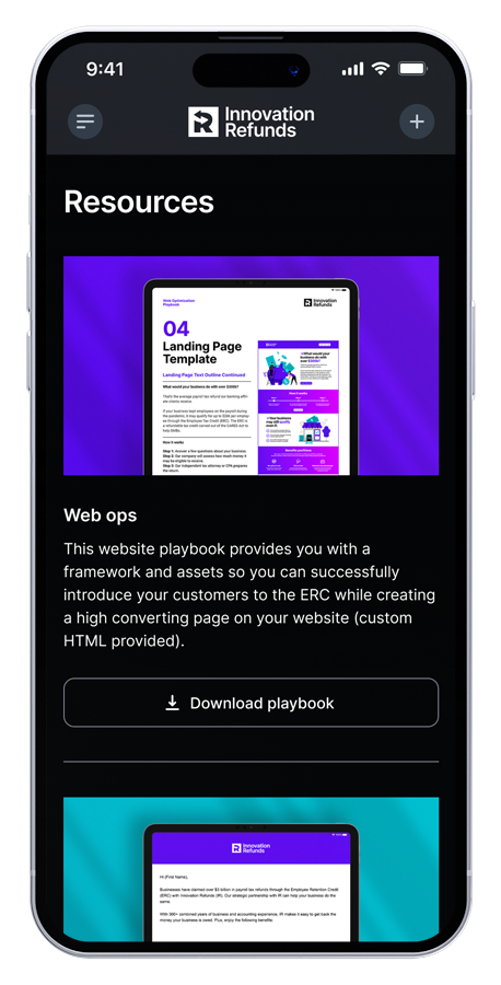
Creating campaigns
Once the new UI was established for the overall site, I then moved to the next customer pain point - creating campaigns. Starting with the mobile experience, I set out to accomplish this action in as few interaction points as possible. Once the user chooses "Create campaign" from the menu flyout, they are presented with a roll-up where they can complete the form with pre-built assets to create their campaign. Users are able to choose between a variety of campaigns types, ranging from landing pages to social media posts.

For the desktop experience, I took advantage of the extra screen real estate to cut down the touchpoints even further with an omnipresent CTA, triggering a left flyout for users to complete the action.

Campaign metrics
One of the biggest challenges our users expressed was a lack of campaign metrics. Once a user creates a campaign they needed to then check its performance. I worked with our marketing team to understand the primary KPIs users needed to track the success of each campaign effort. This was key to maintaining customer engagement.
Users can filter list based on campaign type.
Users can view KPIs to understand campaign performance.
Users can edit or delete each campaign.


Users can filter list based on campaign type.
Users can view KPIs to understand campaign performance.
Users can edit or delete each campaign.
Light/dark mode
To offer our users an even more delightful experience, as well as ensure optimal accessibility, I set out to establish a light and dark mode option as part of our post-MVP rollout. One important point of feedback that came out of our customer interviews was that overall experience was critical to user retention. By providing users with the option to customize their experience I believe we can increase adoption rates even further.
Mobile screens


Desktop screens
Dev hand-off
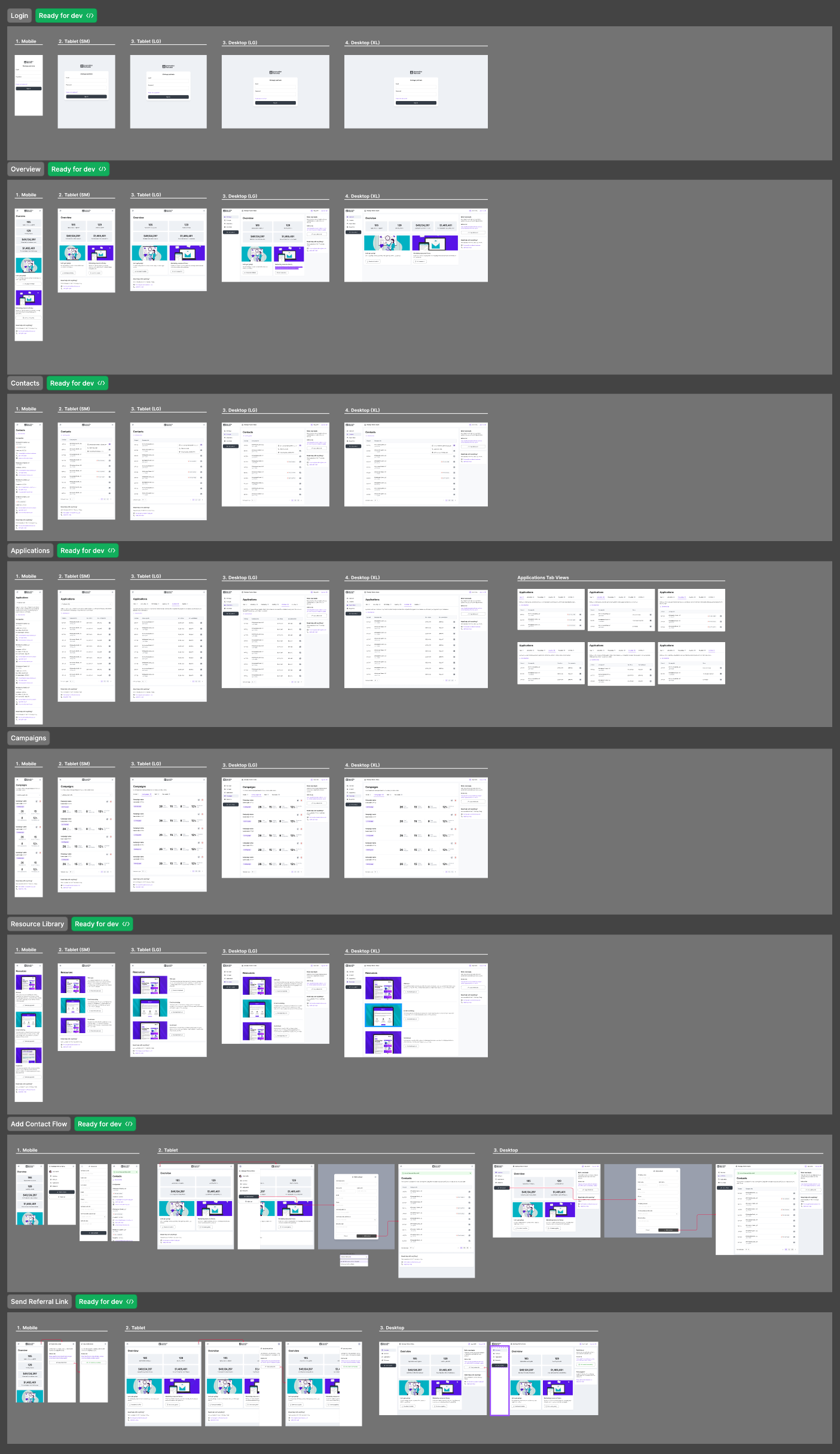
Once all designs and flows were approved by our stakeholders, I then packaged up the designs in Figma for engineering hand-off. I organized the file based on the main sections of the platform and called out the various device sizes. The file structure matched the user stories from which our engineering and product teams were working. This allowed our engineers to easily identify each section they were responsible for shipping. I set up several sessions with our dev teams to walk through the various sections of the file to mitigate any questions during development.
Impact and outcomes
Post-mortem
After our initial MVP launch, the greater product team convened to talk through our overall performance in meeting our porject objectives. Not only did we conclude that we met and exceeded our initial goals, we were able to ship our MVP within the tight turnaround window set forth by steakholders. This allowed our marketing team to begin seeing improved business results for our affiliate partnership program.
Results
Given our initial goals and objectives, we saw the following results in the first two weeks of post-launch:
More than 50% increase in customer adoption
25% increase in customer campaigns
10% increase in overall customer leads