Affiliates portal
Affiliate portal aimed at leveraging partnerships to drive customer referral program for increasing business.
Problem
The analytics team at Innovation Refunds identified the need to redesign thier affiliates portal. The previous site was built using Hubspot and the experience was clunky and difficute for users to navigate. This resulted in a significant drop-off of affiliate partners who accessed the site to drive referrals for the business.
Solution
The objective was to develop a custom-build platform to create a frictionless user experience for affiliate partners to effectively manage leads and initiate marketing campaigns to promote various credits and incentives to small business owners. The primary focus was to streamline and simplify the experience.
Process
Once I was assigned to be the design lead for this project, my first step was to set a kickoff meeting with our key stakeholders to clearly understand the challenges, requirements, timeing, and business objectives for the project. I then turned the requirements into epics and user stories to properly plan out the project scope. From there, I reviewed the user feedback to begin diagramming the user flows to best solve user challenges. Once the user flows were reviewed and approved, I then moved to the wireframing and design phase, leveraging our existing design system to establish a clear and consistent visual experience. Once all designs were approved, I then worked with our engineering teams to transition into the build phase of the project and plan the release schedule for MVP delivery.
Role
I was the lead designer responsible for end-to-end design and execution.
Design process
Requirements gathering
Discovery & research
Information architecture
User flows
Wireframes
Mobile designs
Desktop designs
Engineering hand-off
Discovery
The analytics team identified customer drop-off while using the existing platform within Hubspot. This experience was clunky with inconsistent interfaces across the platform, which resulted in confusion and frustration for the user. The objective was to redesign a frictionless user experience for affiliate partners to effectively manage leads and initiate marketing campaigns to promote various credits and incentives to small business owners.
I identified the following goals for MVP:
Consistent experience/interface across the platform
Responsive/mobile design
Clear information architecture
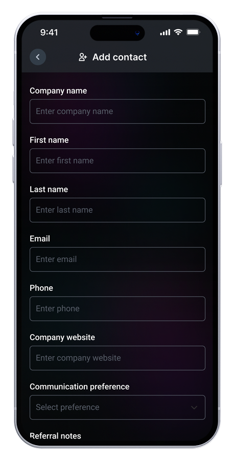
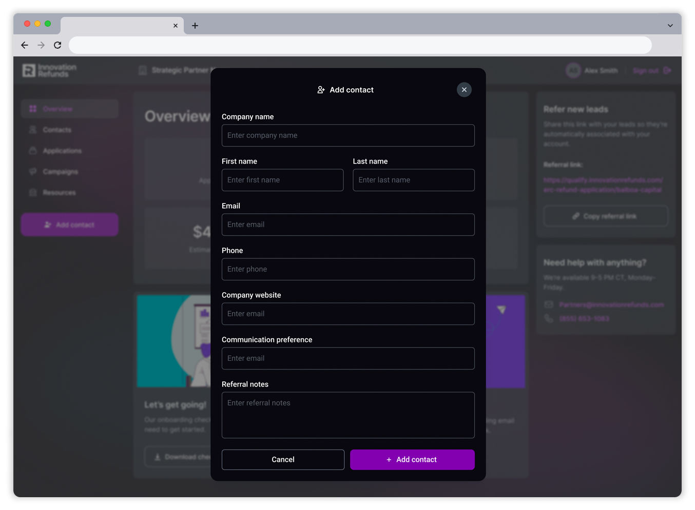
Streamlined "add contact" flow
Metrics-focused campaign management experience
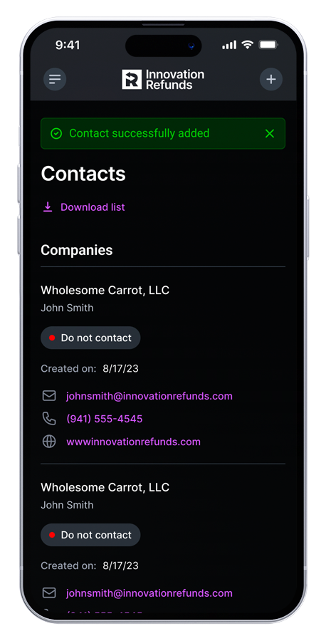
Decluttered contact management view
Persistent actions for key user functions
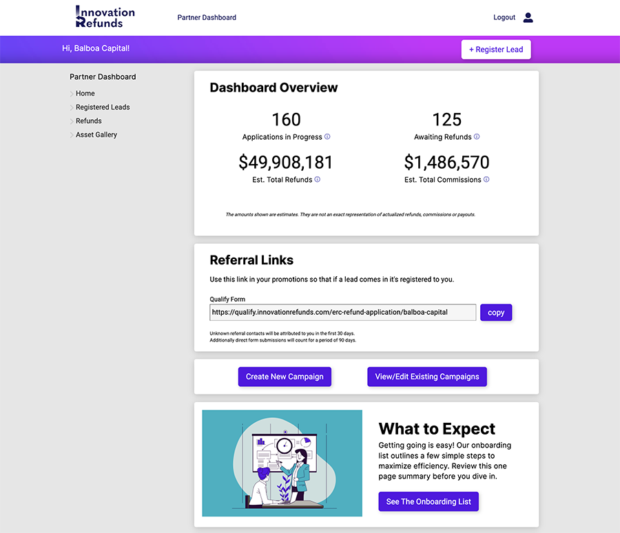
Previous experience
User flow
The first step in the design process was to establish the overall flows for the main functions of the affiliates portal. We needed a seamless way for users to add contacts into their portal, as well as having the ability to copy their affiliate link for marketing outreach. I wanted to create a frictionless experience with as few clicks/taps as possible.


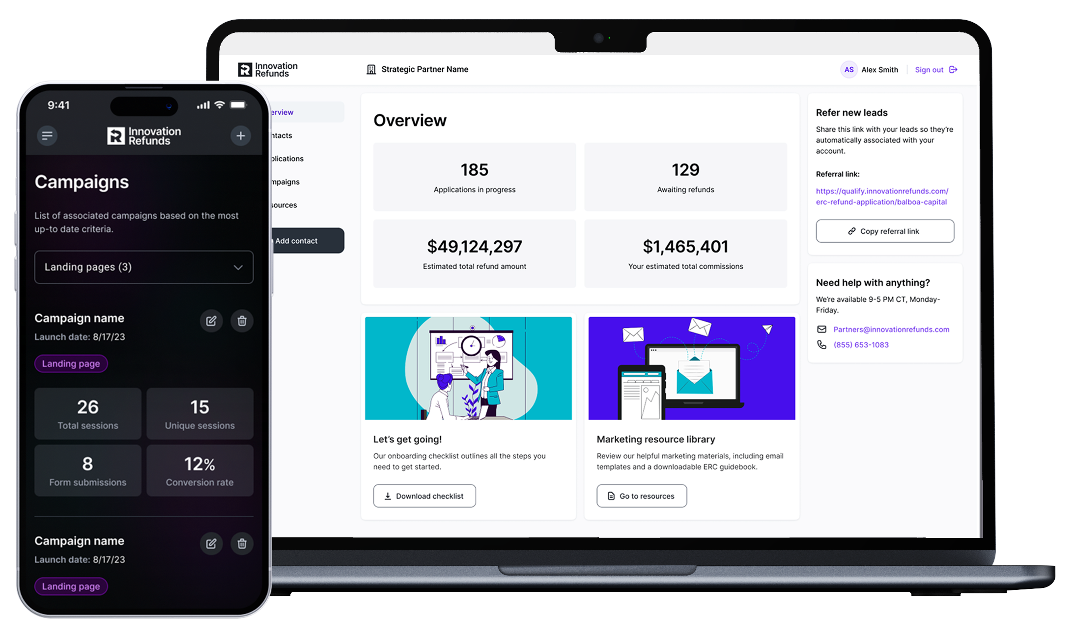
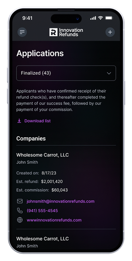
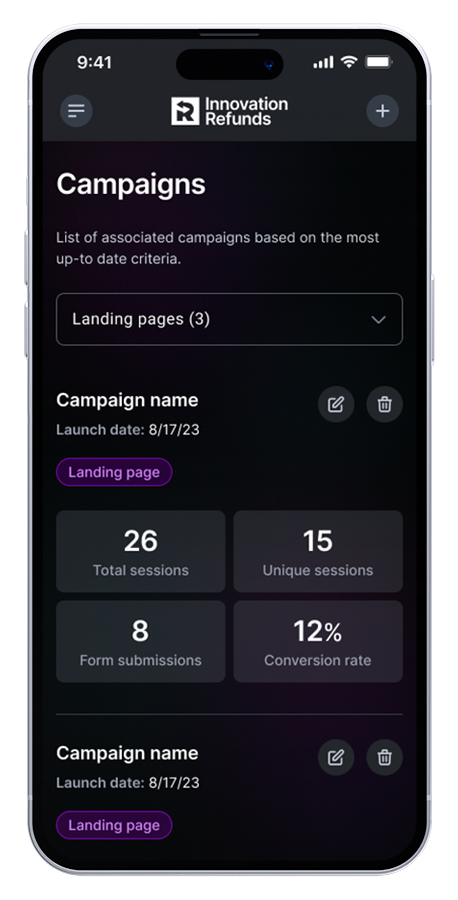
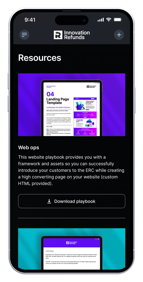
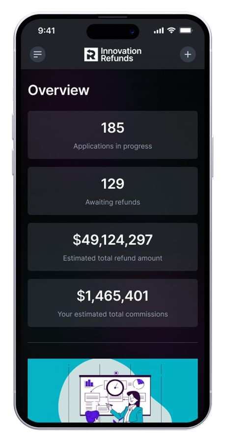
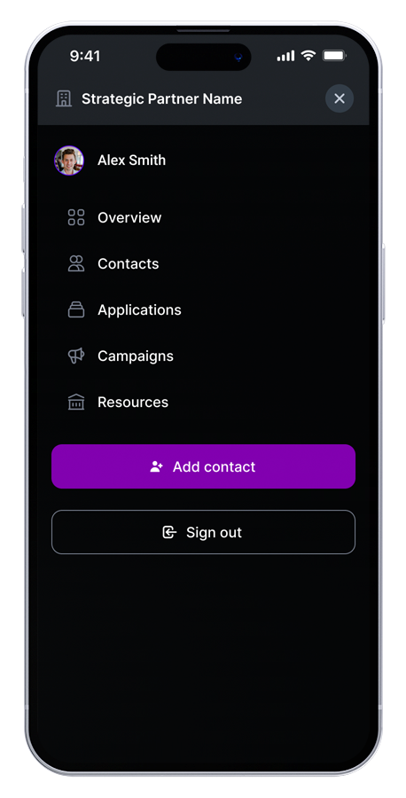
Mobile designs
Taking a mobile-first approach, I began to design the UI layer of the portal. I began by leveraging our internal design system and brand guidelines to establish the overall look and feel, applying our colors, font families, and layout. My approach was to create a clean and intuitive interface, removing as much clutter as possible, allowing for a more frictionless experience within the mobile view. Once the light mode style was established, I then created a dark mode version for the entire portal.
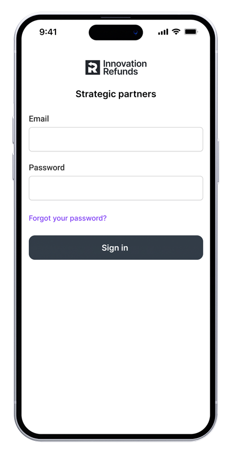
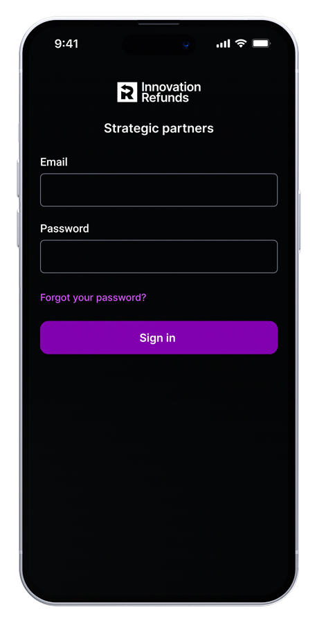
Sign in
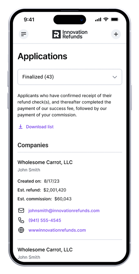
Applications
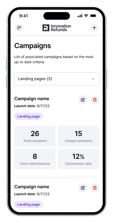
Campaigns
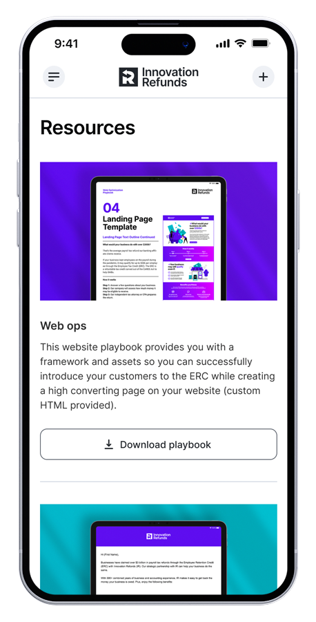
Resources
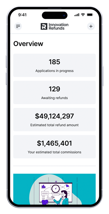
Overview
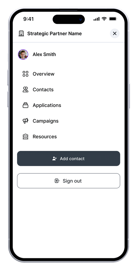
Flyout
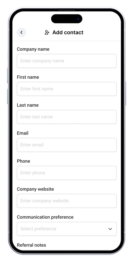
Add contact
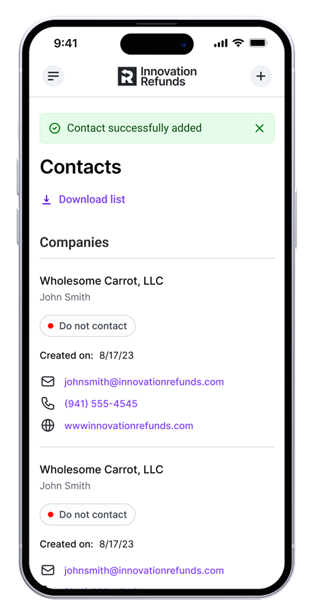
Confirmation
Sign in
Applications
Campaigns
Resources
Overview
Flyout
Add contact
Confirmation
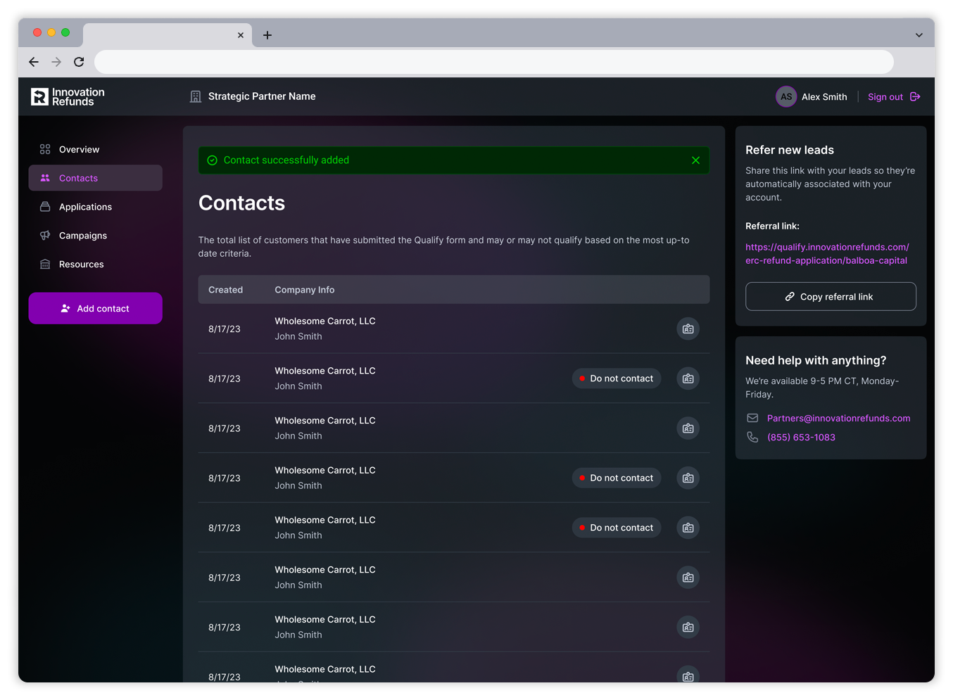
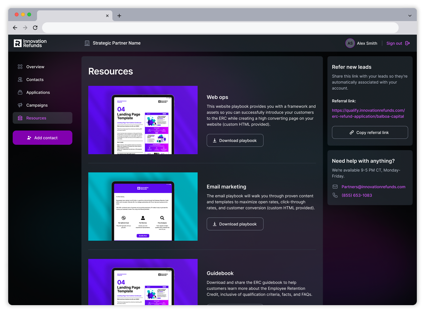
Desktop designs
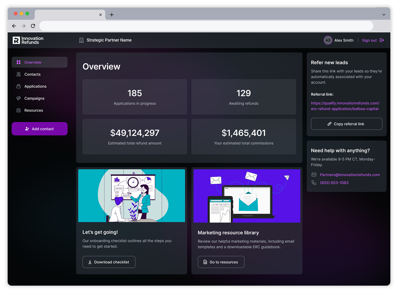
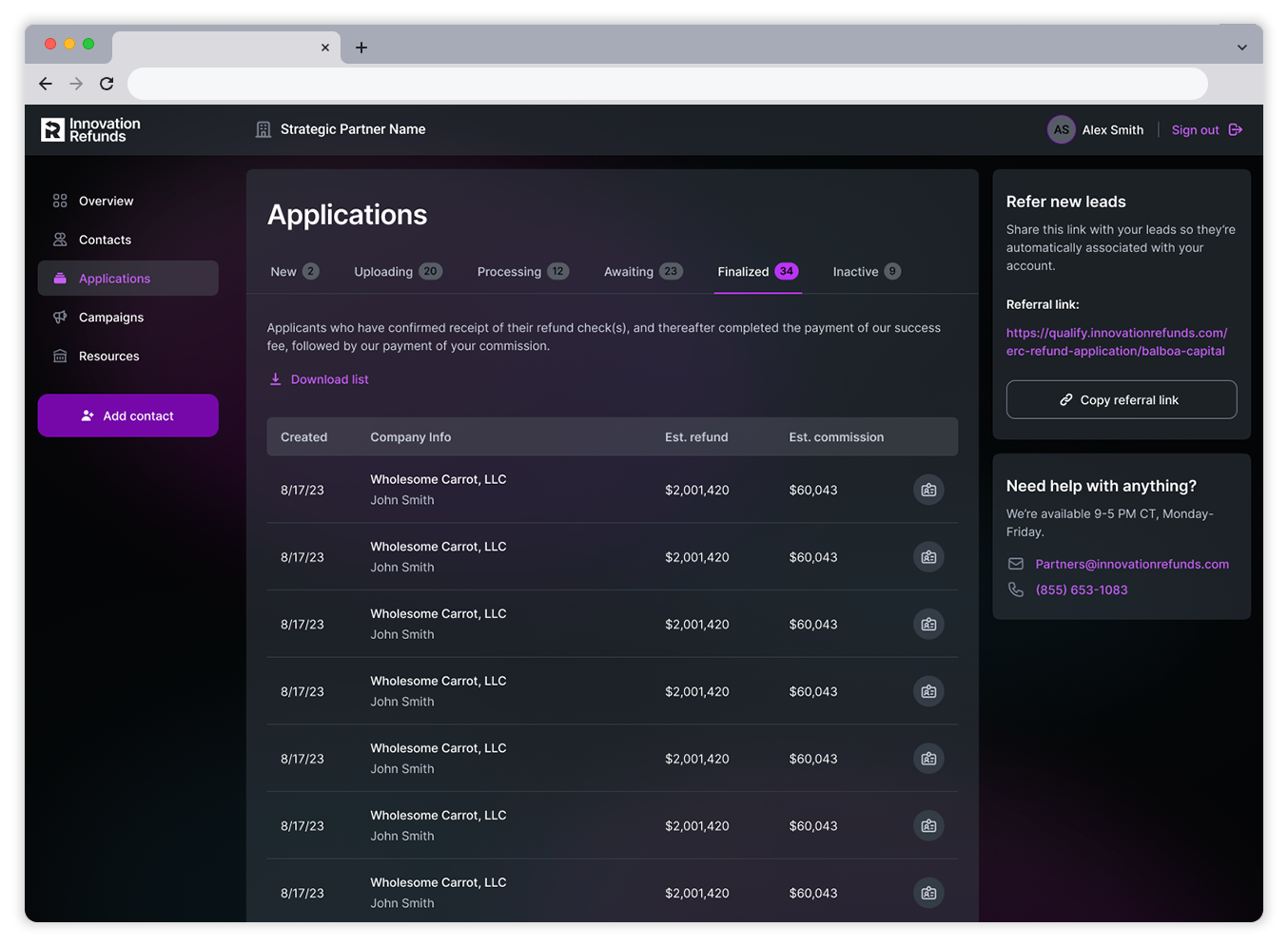
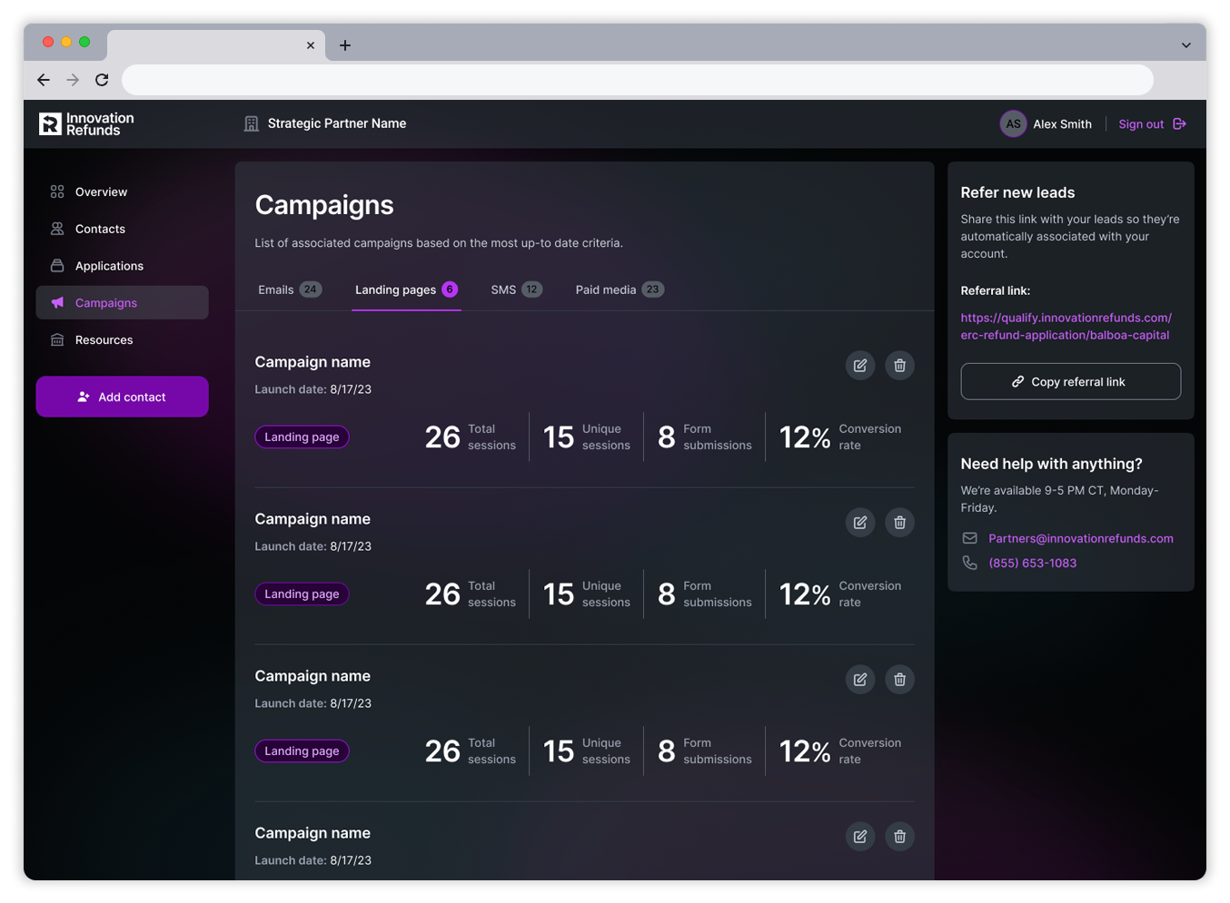
After the mobile and tablet experiences were established, I then worked to take full advantage of the maximum real estate available within the desktop view. I wanted to reduce the amount of touchpoints required for the user to access the various action items within the portal. This allowed for the most optimal experience for the user when managing their contacts and creating campaigns to drive business objectives.
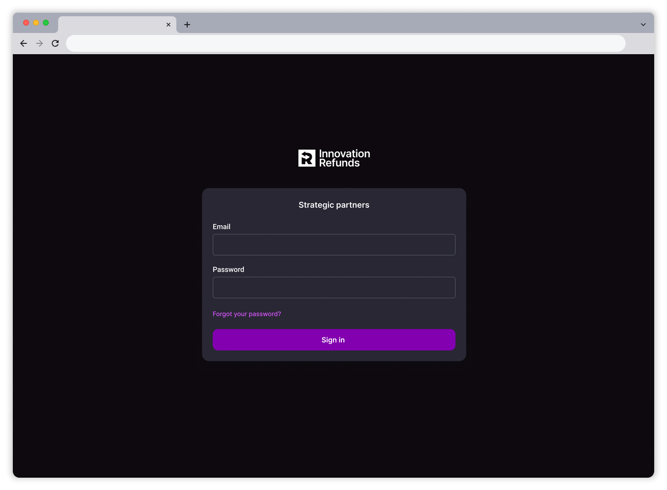
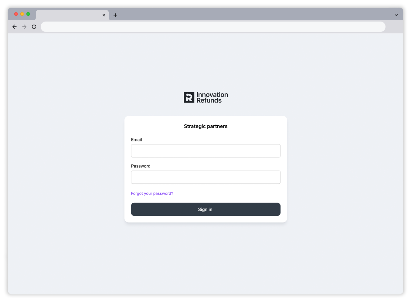
Sign in
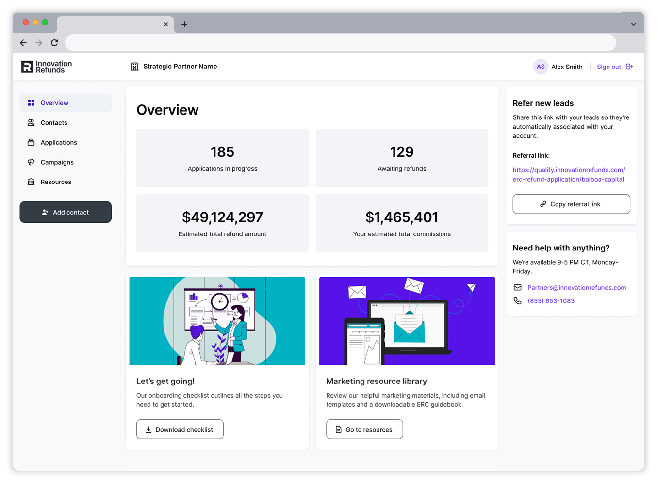
Home
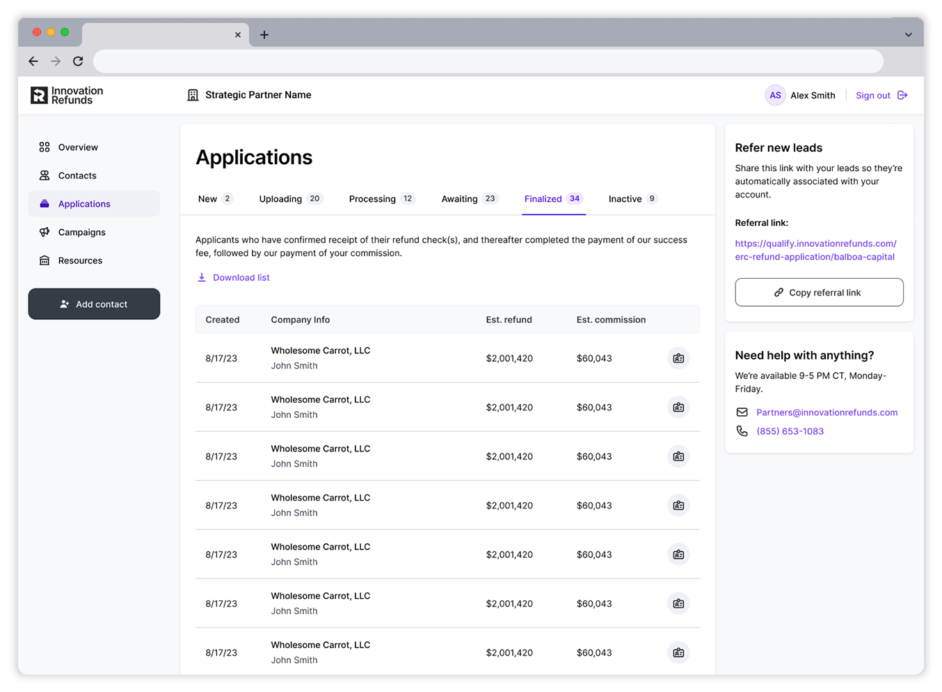
Applications
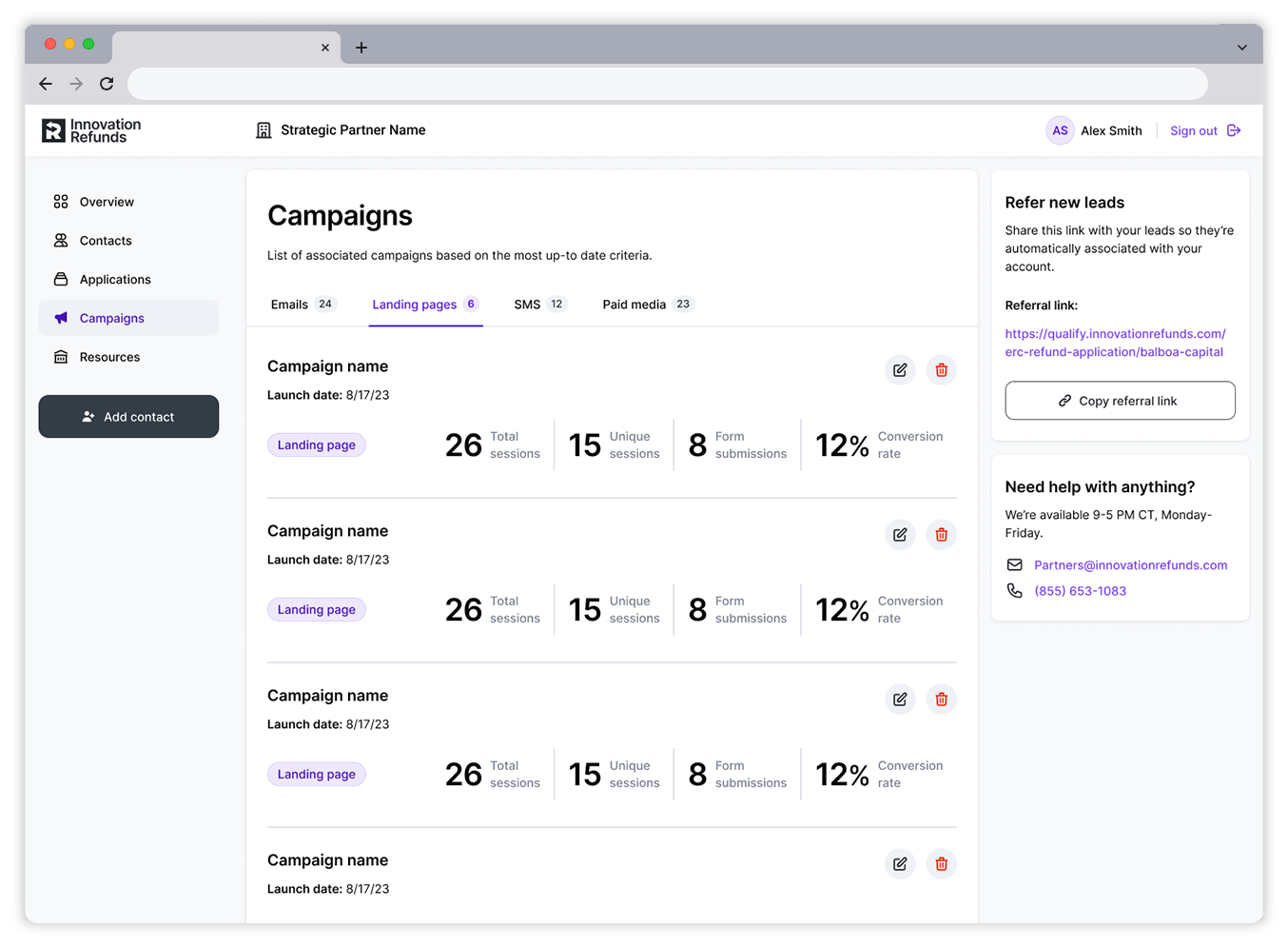
Campaigns
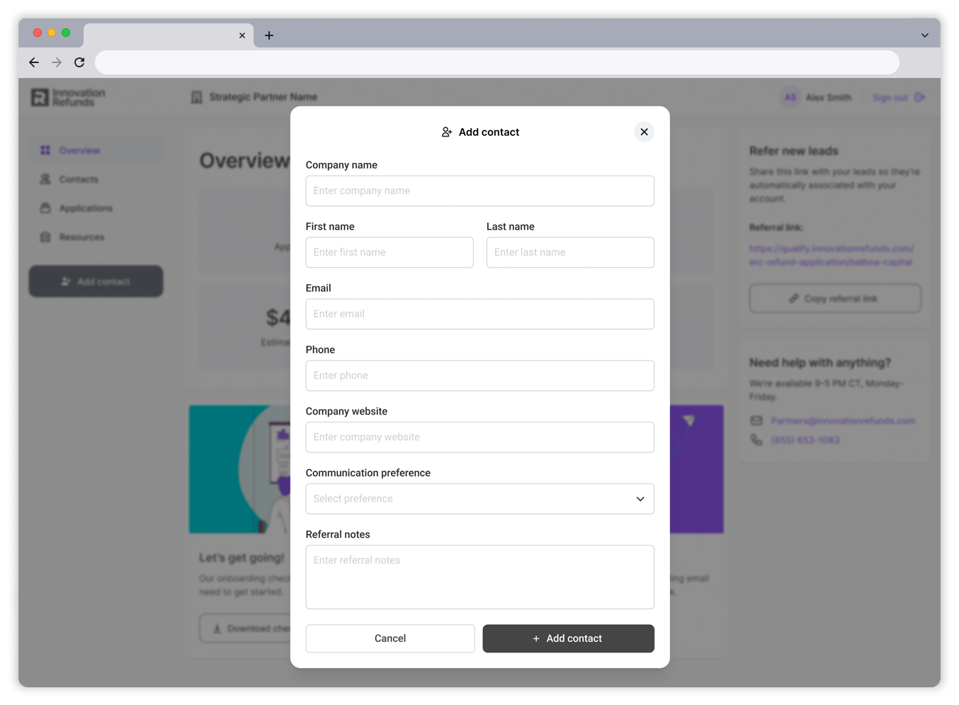
Add contact
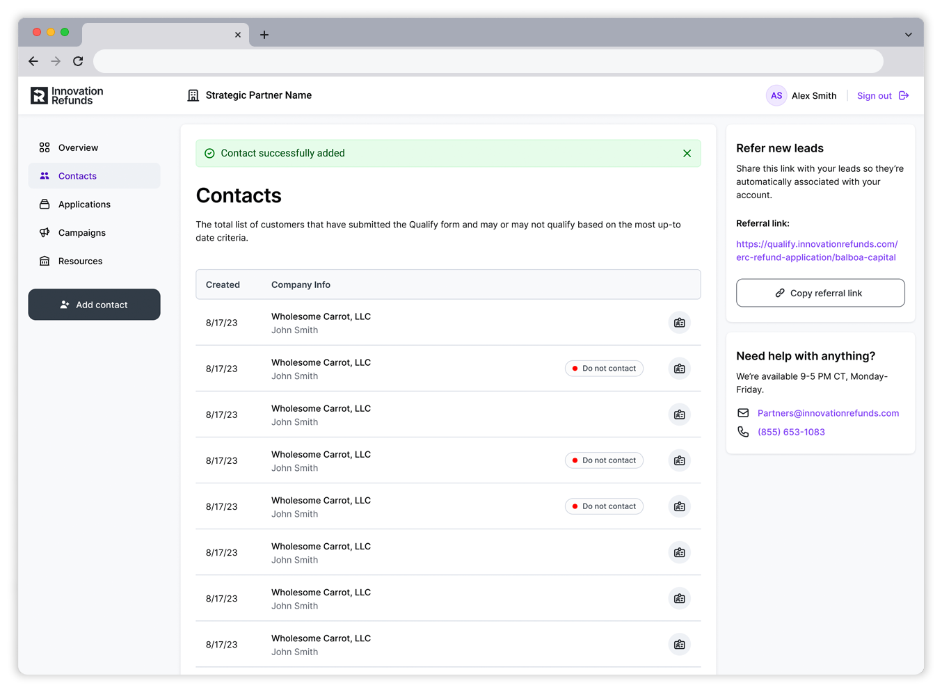
Confirmation
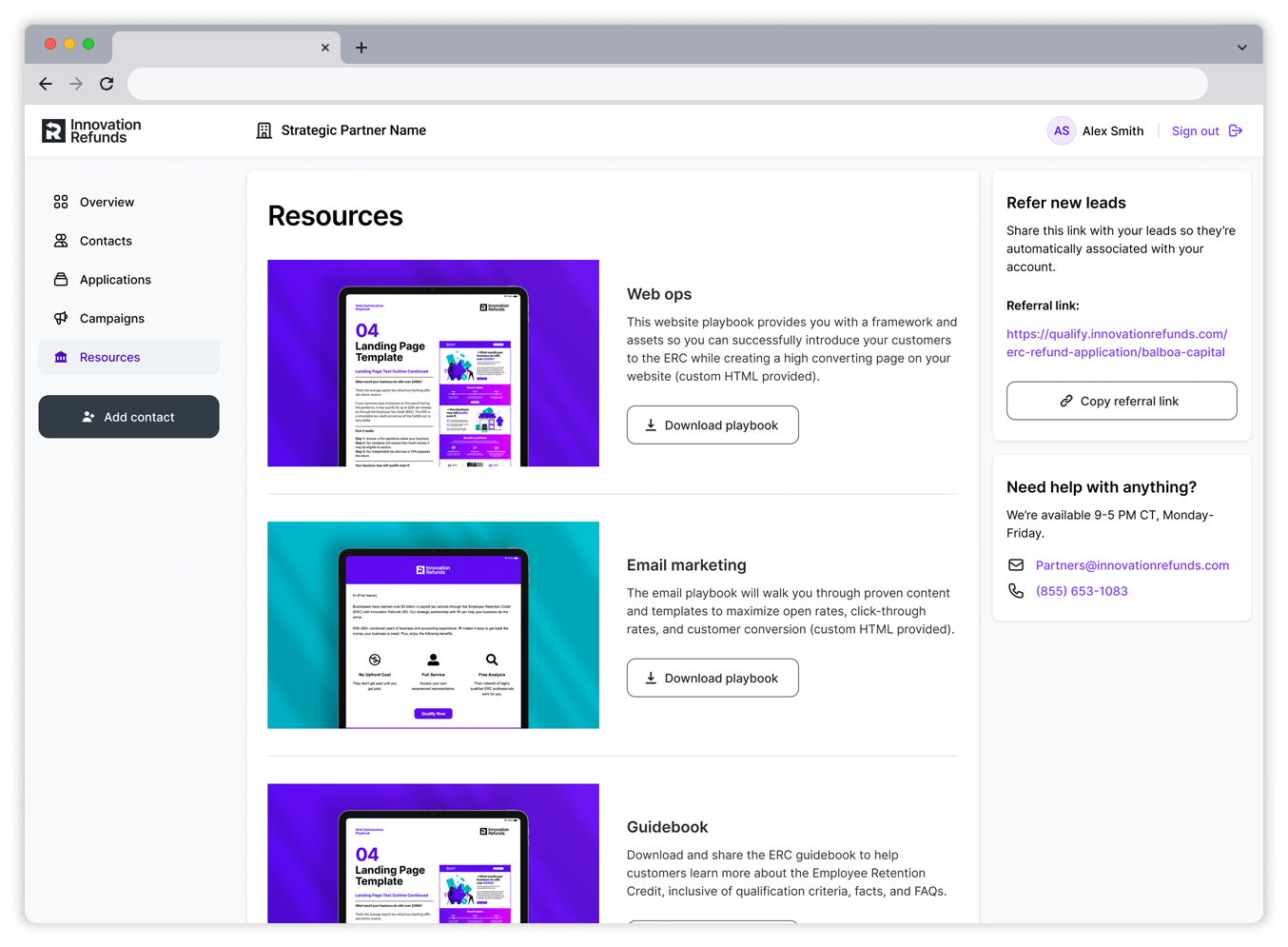
Resources
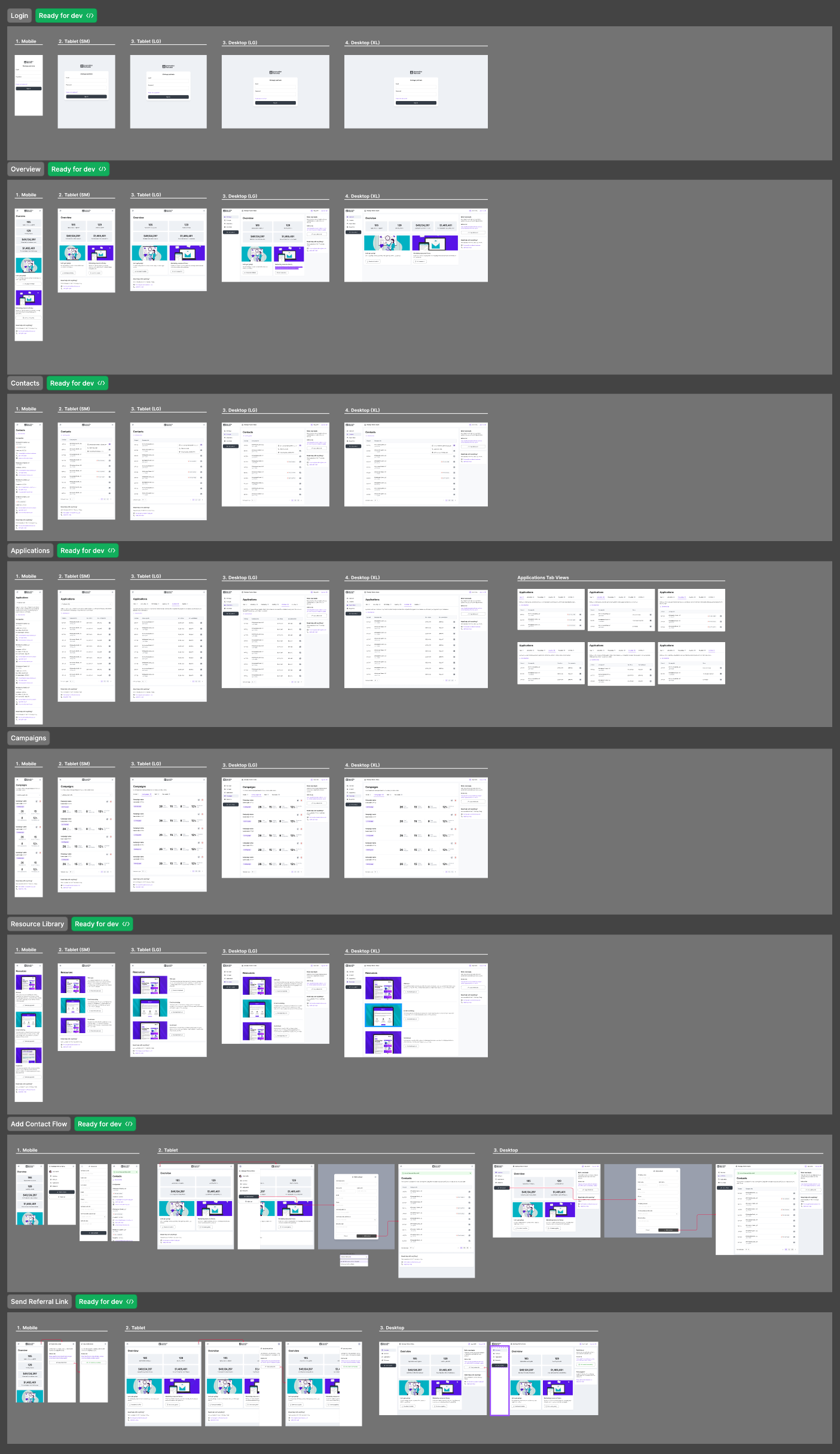
Dev hand-off
Once all designs and flows were approved by our stakeholders, I then packaged up the designs in Figma for engineering hand-off. I organized the file based on the main sections of the platform and called out the various device sizes. The file structure matched the user stories from which our engineering and product teams were working. This allowed our engineers to easily identify each section they were responsible for shipping. I set up several sessions with our dev teams to walk through the various sections of the file to mitigate any questions during development.